User Research || UX/UI || Prototyping
For the University of Applied Sciences (HvA) I collaborated with other designers on redesigning the user experience of their minor course selector, known as the Minoren Kieswijzer.
The university had figured that a lot of students had trouble with finding the minor course that is right for them. So they wanted to make changes to help the students find their match.


To figure this out I looked into the original system and the possible reasons why it would fail at achieving its goal.
Going through the portal with a ‘Be the User’ approach showed that it was fairly difficult to align your interests to specific minor courses. This immediately causes you to need to look through most of the catalogue without much of a guideline, making it so that you also just might miss something that could be of interest to you. And something else that was jarring was that some of the original wording could be interpreted in different ways, making some of the directions somewhat unclear.
With a similar user-based approach as when I tested the product myself, I tasked other possible users with finding a minor course that would be of interest to them. But I didn’t start them off within the portal, I had them first figure out how to get started. Because at this point I hadn’t yet concluded that the portal itself was solely to blame. Through this method I concluded that finding the portal itself was already a struggle for most users, even when they knew of its existance. And using the portal was confusing, unclear and difficult. I’ll go over this research in further detail later.
As for the rest of the stakeholders, I held interviews with the coördinators behind the portal and the teachers who teach the different courses. Through these interviews, some very important details came to light as to why the portal itself was so unclear to the users. The detail pages on the courses were constructed by the teachers themselves without much direction and they could decide on which tags applied to their courses (changing the way they would appear among search results). This causes some of the descriptions to be very detailed and others very bare bones, depending on the teacher, without any consistancy between the different courses, creating a devide between the courses from the very start and creating confusing and often incomplete detail pages.
During the user testing and stakeholder interviews I also went ahead and asked about their expectations for a tool like this. Because there needs to be a reason to use the tool. When it came to students that were just starting to look for a course and people who had already completed one; Most of them went to a different website instead. So by setting up a list of expectations and goals for the different stakeholders we could pick out points of focus whilst creating a new version of the tool that would support all stakeholders. Students should be able to find the course that’s right for them, teachers should have the ability to actually give their courses through having enough students apply to them and the general school commity wants to create a better environment for both students and employees.
A breakdown of the User Tests, Interviews and Results
I did user tests with a wide arrange of students from different years and faculties. And depending on what year the students were in these tests were done slightly different.
For second and third years I initially tasked them with finding a minor course that would be of interest to them. All I did was put them behind a laptop and have them figure it out. Almost all students went to use a different tool than the Minoren Kieswijzer. This tool is called “Kies Op Maat”.
Most of these students either didn’t know about the existance of the Kieswijzer, or otherwise had previously tried to find it and didn’t. Only a handfull could actually locate the tool, but most of those also used Kies Op Maat.
How I went about it with the first years was that I first started them off on the official page of the University and had them try to find it there. This once again showed how difficult to locate the tool was. Plenty of them just didn’t amange to find it or took more than 10+ minutes to locate it. The ones that did find the tool also let me know that they would have given up on finding it after a maximum of 5 minutes in other circumstances. It’s not being adversitsed nearly enough even though it’s a very important tool for people who are looking for a minor course.
Conclusion: It’s not being displayed clearly and it’s not adversitsed enough.
To test the Minoren Kieswijzer I created two different groups.
Group 1.
The first group was tasked with looking for a minor course they would like. Something that would interest them specifically.
Group 2.
The second group was tasked with finding a minor course based on a set of predetermained details to see if they could locate specific minor courses.
Group 1 ran into the problem that there was seemingly no way to select specific topics. This caused them to run into courses that did have similar concepts they thought were interesting, but the themes didn’t match. Another thing they ran into was that when they were looking around they wanted to look at a few different courses, but there was no way to save your interests to quickly find the previous courses you’d looked at again.
Group 2 on the other hand had the problem that using the few tools they had to look for specific courses still left them with a long list of courses that didn’t fit the full description. The general ‘filter’ of the tool didn’t seem to do its job very well in that regard.
Conclusion: The information displayed and used to find courses didn’t match up to expectations.
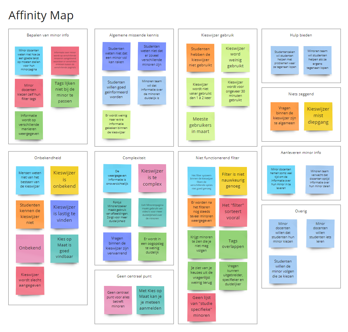
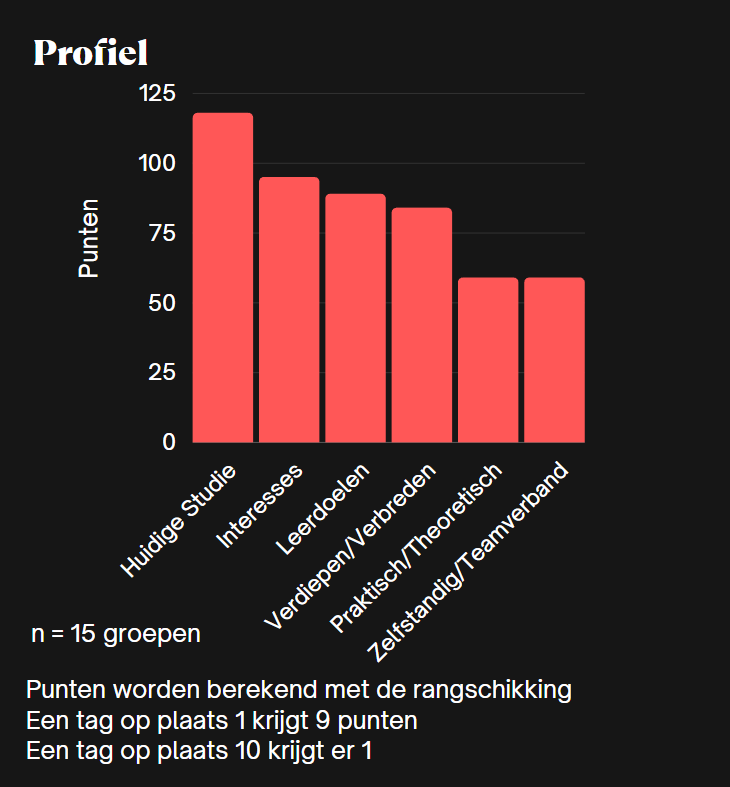
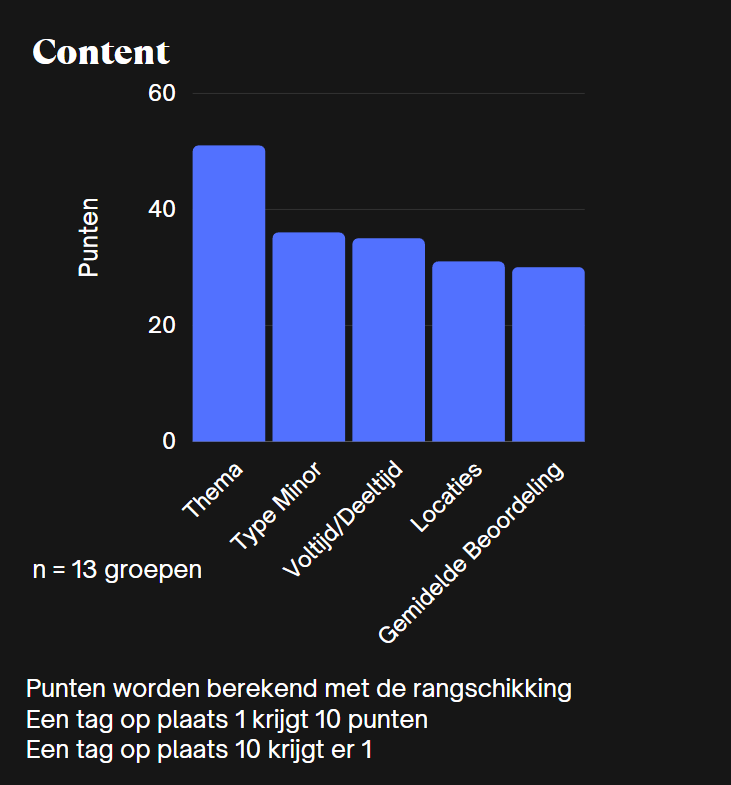
A simplified breakdown of the steps I took during Prototyping
After having gathered all the details from the research I started compiling all the information through different methodes. By taking into account the wants and needs of the different stakeholders I could create a list of features that could be implemented into the design. With all these features prepared and by setting up a user flow I could start working on creating a low-fi prototype.
With this low-fi prototype I went ahead and once again gathered groups of students from different years and had them go through the prototype. By getting a feeling for how they are navigating through the prototype I can gather information of the user-flow I’d set up and the usefulness and impression of the different added functionalities. With this newfound information I went ahead and started iteratively working towards a high-fi prototype.

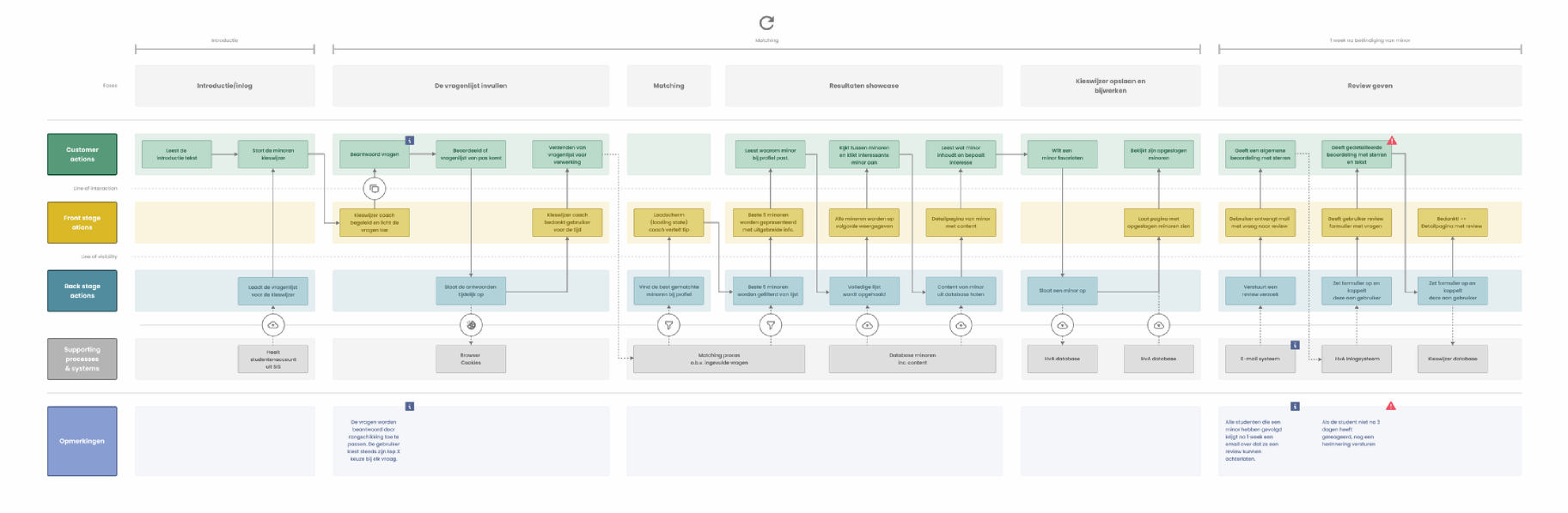
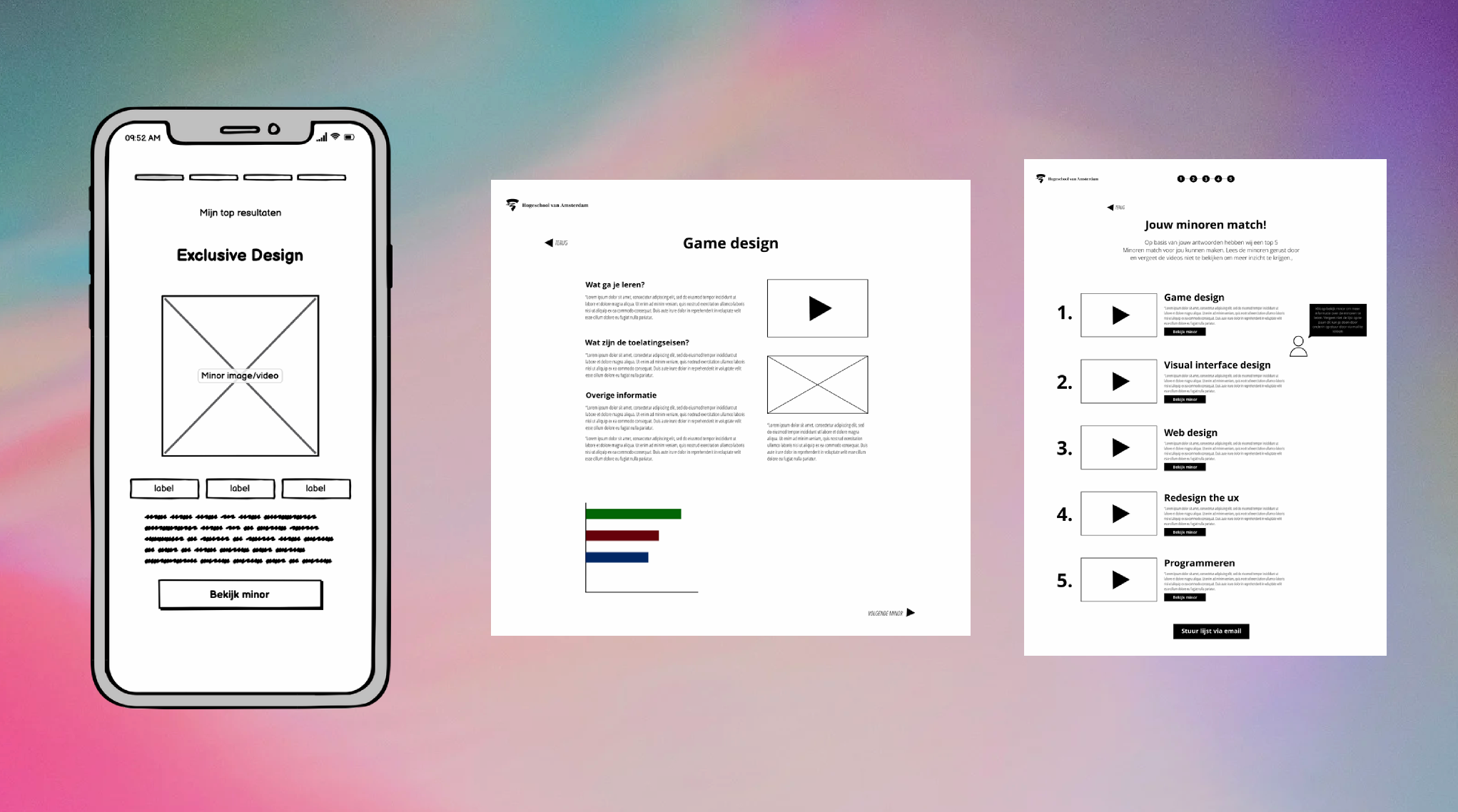
With now having created a high-fi model I started doing A/B tests with the original version of the tool. This way I could identify if I’d managed to complete the different goals I had created. Through these tests I learned that I’d manages to tackle most of the issues the previous version had.
I cleared up the language used, changed the way the tag system worked, fully reïnvented the filter system and kept true to the stype of the University with some newly added highlights.
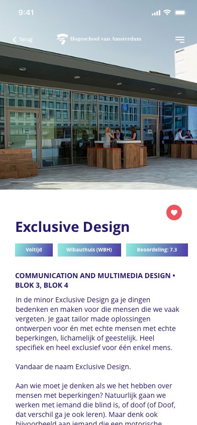
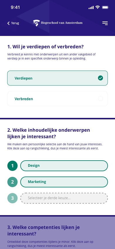
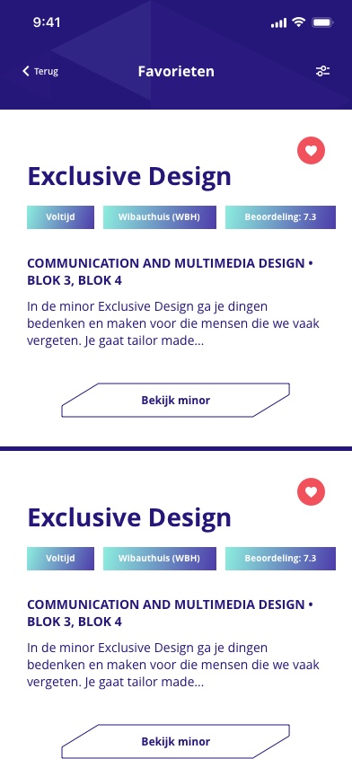
As a final addition I also added recommendations for the implementation of the system. To avoid having some teachers giving close to no information and others telling too much it was recommended to add a template that the teachers could fill in to streamline information. And the teachers could find help in describing their activities by using the comments from students that have previously completed the program.
And to make sure the students can actually find the portal it was recommended to add a banner on the website of the university and send out more e-mails with links attached to the portal for students who are approaching that time in their school years. And instead of using a single link on the website, actually give direction to where they can find it, or make the tool show up in google search results.
Phone
Chamber of Commerce
VAT
Phone:
+31 6 15450945
E-mail:
Chamber of Commerce:
91750075
VAT:
NL004913216B34
